Maps of How Scotland’s Regions Really Voted

Good geographers know that maps can lie to you. Every map emphasizes some aspects of a place at the expense of others, giving it a lot of power to lead careless readers astray. Maps of Scotland’s recent independence referendum are misleading us about the reality, even if not intentionally.

Premium members click here to view this article in the ad-free members area. Not a member yet? Subscribe now!
 

Map of results in Scotland's September 18, 2014 independence referendum. Voters were polled on whether or not to separate from the UK. Map shows relative proportion of yes and no votes for each of Scotland's council areas, using a gradient rather than contrasting colors for small differences.
Map by Evan Centanni, based on blank map by TUBS and NordNordWest (CC BY-SA)

By Evan Centanni

Misleading Maps
By now you’ve probably heard the results of Scotland’s independence referendum: voters chose “no” by a solid margin of 55% to 45%. Check out our previous article to learn more about what would have happened if Scotland had voted “yes”.

Maps like this one from the BBC and this one from Wikipedia have popped up since the results came out, showing how each of Scotland’s council areas voted. Most of the country is in red for “no”, with a few “yes” areas in green.

But if one area went 51% for “yes”, and another 51% for “no”, those two areas actually voted almost identically – yet contrasting red/green maps make us feel like they’re polar opposites (not to mention that one-in-thirty readers has trouble seeing the difference between red and green).

How the Councils Really Voted
Whether each area’s people voted just over or just under 50% in favor isn’t actually that important. What matters is how far the balance was tipped in each region. This is not the U.S. presidential election, where the final vote is actually made by delegates obligated to go by the majority in each state. All the votes across Scotland were pooled together to determine the result, so which side of the 50-yard line each area came out on has no effect .

In reality, the vote was split in every part of Scotland. No council area voted more than 58% in favor of independence or more than 68% against. The above map is designed to show how close the vote really was all across the country. Since no area came close to voting completely for independence (blue) or completely against it (red), on this map Scotland’s council areas all end up colored in purplish hues.

For Your Reference: Map of Scotland’s council areas with names labelled
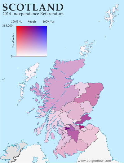
Map of results in Scotland's September 18, 2014 independence referendum. Voters were polled on whether or not to separate from the UK. Map shows relative proportion of yes and no votes for each of Scotland's council areas, using a gradient rather than contrasting colors for small differences and shading to represent the total number of valid ballots case in each region as a way of normalizing for population.
Map by Evan Centanni, based on blank map by TUBS and NordNordWest (CC BY-SA)

The Glasgow metropolitan area, the main region where independence bagged more than half the vote, appears as a slightly bluish purple lump in the bottom-center, while border areas that voted “no” by a larger margin turn out purplish-red (as does Orkney, the group of islands just north of the Scottish mainland). Most of the remaining councils voted more narrowly against independence, showing up in intermediate hues.

Population Matters
In fact, the above map still hides an important factor in the results: the council areas didn’t each have the same number of votes. While turnout was high across the country (75-91%), population varies drastically from council to council. Glasgow city cast nearly 356,000 ballots, while rural Orkney had a mere 14,887.

The second map (at left) tries to show the relative importance of each area in deciding the countrywide result. Here, the same range of purple hues are made lighter or darker depending on how many total valid ballots were cast in each council area. It’s a bit more complicated to read, but the message is clear.
Flag of ScotlandCountry Name:  
• Scotland (English, Scots)
• Alba (Scottish Gaelic)
Current Status:  
Country within the United Kingdom 
Capital: Edinburgh

The outer islands’ voting populations are so small that they look white to the naked eye, with each group contributing only about five percent as many votes as the biggest city. Meanwhile, Scotland’s two major cities of Glasgow (left, bluish) and Edinburgh (right, reddish) stand out sharply with their huge numerical advantage.

The country’s number three city, Aberdeen, seems to have its votes divided between the surrounding Aberdeenshire (large, medium-shaded chunk at upper-right) and the city proper (lighter-shaded kernel along the coast). Meanwhile, the Scottish Highlands, the huge region at upper-left, are sparsely populated but carry some collective clout due to sheer size.

Maps that contrast colors on either side of the 50% mark may be a simple and attention-catching way to show election results, but they mislead us by making countries look more geographically-divided than they really are.

See Also: How Sharply Divided is Ukraine, Really? Honest Maps of Language and Elections
How Sharply Divided is Ukraine, Really? Honest Maps of Language and Elections

There’s no question that Ukraine’s current crisis arose from major political divisions in the country, and it’s true that language is an issue. But some online news websites have sensationalized and exaggerated these divisions through misleading maps. PolGeoNow offers a pair of maps that better communicate the blurriness of the supposed lines between western and eastern Ukraine. 

(For a map of current events from January up to this week, including protester control, government occupations, and the Russian invasion, purchase our premium map of the Ukraine crisis or become a member.)

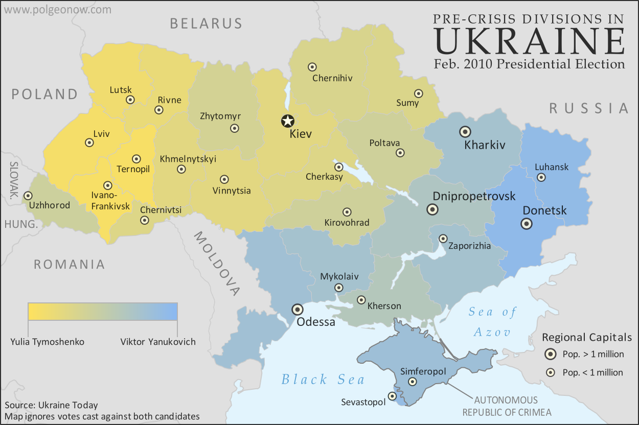
Map of the results of Ukraine's February 2010 presidential runoff election between Yulia Tymoshenko and Viktor Yanukovich
A more honest map of Ukraine’s 2010 presidential election. By Evan Centanni.

Premium members click here to view this article in the ad-free members area. Not a member yet? Subscribe now!

Article by Evan Centanni 

Misleading Ukraine Maps
In January, the Washington Post’s Max Fisher wrote a popular map-illustrated blog post about the political and linguistic divisions fueling Ukraine’s crisis, then at the height of its pro-Europe protest phase. Later, CNN followed the Post’s lead and published a similar set of maps. However, the maps in both articles are designed in a way that makes the divisions look much sharper and more black-and-white than they really are. There’s not, as Fisher preposterously claims, “an actual, physical line” splitting Ukraine in half. Instead, there’s a gradual shading of mixed populations whose ethnic identities and voting history don’t always correlate to the country’s current political divisions.

The 2010 Presidential Election
The centerpiece of Max Fisher’s Washington Post article is a map superimposing early protest information on a map of results from the 2010 presidential election, in which the now-ousted Viktor Yanukovich won a majority over opposition candidate Yulia Tymoshenko. Although Fisher did distinguish in the map between regions voting overwhelmingly for one candidate and regions where the winner received a narrower majority, the sharpness of the east-west division is badly exaggerated by the colors he chose.

Using orange for Tymoshenko and blue for Yanukovich was normal, but the regions with highly-mixed results should have used some color in between. Instead, the map uses light orange for small Tymoshenko victories and light blue for small Yanukovich victories, making regions that actually weren’t far apart in their votes still look sharply separated due to the clashing colors. CNN’s equivalent map is even worse, using bright red and bright blue. With eye-grabbing, clashing colors like that, it’s no wonder someone might think Ukraine is literally bisected down the middle.

But that’s just not the reality. As the map above shows more clearly, many regions, including even some in the west, voted only narrowly for one candidate over the other. The colors don’t transition perfectly smoothly from one end of the country to the other – every region went to one candidate by at least 10 percentage points – but there’s not a sharp dividing line either. A more detailed map, with the districts of each region separately colored, would probably show an even less distinct divide.

So how well do the 2010 election results map to the current crisis? Not too badly. The Lviv region did end up taking a leadership role in the protests against Yanukovich, and Donetsk has been among the forefront of regions opposing him. However, protests did eventually spread across the whole country by February, and there were some exceptions to the yellow vs. blue pattern. If you’d like to make a detailed comparison, check out our political overview map report for the Ukraine crisis, accessible to premium members or by individual purchase.

Map of languages in Ukraine by region (oblast), showing gradation between Ukrainian and Russian languages while marking regions with large proportions of residents with other native tongues
Ukraine is even less clearly cut in half by language. Map by Evan Centanni.

Native Languages: Ukrainian vs. Russian
Both the Washington Post article and the CNN post also feature maps of the languages spoken in Ukraine. CNN does better on this than on the election map, at least choosing somewhat similar orange and red colors in an attempt to show the gradient in the proportion of Russian speakers across Ukraine’s regions. The Post’s Max Fisher, on the other hand, continues with the misleading contrasting colors, cutting Ukraine simplistically into an orange half and a blue half for the Ukrainian and Russian languages.

Most egregiously, Fisher’s map uses the label “Predominantly Russian-speaking” to blanket a number of regions where there are actually more native Ukrainian speakers than native Russian speakers. As the above map shows, Ukrainian is actually the majority language across most of the country. Only four regions – Donetsk, Luhansk, Crimea, and the special municipality of Sevastopol – have more Russian than Ukrainian speakers.

When comparing this map with the election map at top, it becomes clear that language is not as great an indicator of Ukrainian politics as some commentators imply. People whose mother tongue is Russian make up only 30% of Ukraine’s population according to the 2001 census, yet Viktor Yanukovich received more than 49% of the national vote in 2010 (as compared with Tymoshenko’s 45%).

It’s true that the strongest opposition to the new interim government is coming from the regions with Russian-speaking majorities, but there may be a specific reason for this: one of the new revolutionary government’s first acts was to repeal a Yanukovich-era law granting legal rights to minority languages such as Russian. (Note that being “ethnically Russian”, at least in official statistics, is not the same thing as being a native speaker of the Russian language; only 17% of people in Ukraine identify as “Russians”; many of the remaining Russian-speakers identify only as Ukrainians.)

Flag of Ukraine Full Country Name:  
• Ukraine (English)
• Ukrayina (Ukrainian)
Capital: Kiev

Other Major Languages
Another fact left out of the Washington Post and CNN maps is that Ukrainian and Russian are not the only major languages in Ukraine. Although they are by far the most widely-spoken nationwide, within several regions there are other languages which come in second or third. By now many followers of the news know that Crimea has significant population of Crimean Tatars, who speak a language related to Turkish. In the Crimean autonomous region, speakers of Crimean Tatar (11%) outnumbered speakers of Ukrainian (10%) in 2001.

But Crimea isn’t the only region with major minority language communities. In Chernivtsi, Romanian (12%) and Moldovan (7%) both outnumber Russian (5%), and in nearby Zakkarpatsia (capital: Uzhhorod) 13% of residents are native speakers of Hungarian. In Odessa, Ukrainian and Russian are the biggest languages, but Bulgarian (5%) and Moldovan (4%) are also present. (Data from Ukraine’s 2001 census, retrieved here).

Graphic of the Ukrainian flag is in the public domain (source).

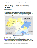
Map of the 2014 Ukraine crisis, before and after the ouster of President Yanukovich, updated to March 3, 2014. Details shown include protester occupations, declarations of autonomy, and Russian invasion.

Want to see a comprehensive map of political control in Ukraine’s crisis from January up to this week? Purchase our premium map report for just $5.99.

Or you can become a member, and get access to all our premium content!

Lies Your World Map Told You: 5 Ways You’re Being Misled

Unfortunately, most world political maps aren’t telling you the whole story. The idea that Earth’s land is cleanly divvied up into nation-states – one country for each of the world’s peoples – is more an imaginative ideal than a reality. Read on to learn about five ways your map is lying to you about borders, territories, and even the roster of the world’s countries.

Map of the world's countries according to the U.S. Central Intelligence Agency
The lines and coloring on this map are hiding major truths about the world’s countries.
(Source: U.S. CIA; public domain)

1) Missing Countries
When choosing what counts as a country, most world maps go by either the official list from their own country or the member/observer roster from the United Nations. Just one problem: there are about ten countries which have declared and enforced their independence, but aren’t recognized by the U.N. or most of the world’s governments. These states may have close ties to a neighbor country, but most of them aren’t at all controlled by the country they’re supposed to be part of.

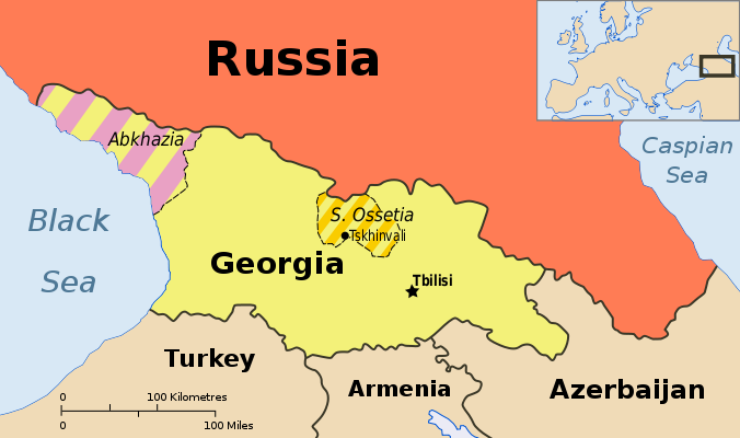
Map showing Abkhazia and South Ossetia, two breakaway states claimed by Georgia.
Abkhazia and South Ossetia operate as independent countries, but are claimed by Georgia and only recognized by a few countries. Map by Ssolbergj (CC BY-SA).

There are some high-profile special cases that warrant at least a note on many maps. Taiwan’s government formally claims to represent non-communist China, though it acts more like a separate country. Palestine, another disputed state, is now recognized as a U.N. observer country despite being forced to share control of its territory with Israel.

Western Sahara‘s status is considered unresolved by the U.N., and a small piece is effectively independent; meanwhile, Northern Cyprus is recognized only by its patron country, Turkey. The self-proclaimed Republic of Kosovo is now recognized by half of the U.N.’s members but not by the U.N. itself.

Other countries escape entirely from all but the most careful of political maps, being misleadingly merged into the countries that claim their territories: Abkhazia and South Ossetia into Georgia, Nagorno-Karabakh into Azerbaijan, and Transnistria into Moldova. These four breakaway states are sponsored by neighboring countries, but the most left out of all is Somaliland, which receives no major support or recognition from anyone, despite managing its affairs completely independently from Somalia.

Unrecognized Countries: More Articles and Maps

2) Incomplete Control
Drawing lines around a country on the map might imply that its government controls all the land within those lines. But that’s often not the case in reality. Even setting aside foreign military occupations like the recent U.S. interventions in Iraq and Afghanistan, many countries’ governments don’t control their whole territories. Aside from the cases of breakaway states as described earlier, this mainly occurs in war zones where rebel groups are actively vying for control of all or part of the country.

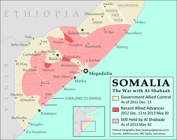
Map of government and Al Shabaab control in Somalia's ongoing civil war
Large parts of Somalia are controlled by Al Shabaab extremists. Click for map attribution info (CC BY-SA).

Somalia is probably the most infamous for this. Its U.N.-recognized government controls around half the country at best, and a few years ago controlled nothing but a part of the capital city! The rest is divided between the religious extremist Al Shabaab and various autonomous states which keep their own counsel on whether to cooperate with the government.

The territories of Mali, Nigeria, the Central African Republic, Libya, and Ivory Coast have all only recently been reunited (either under the former government or under the rebels), and Syria is the current model of a state falling apart through violence. Other countries with rebels firmly controlling parts of their territory are Yemen, the Democratic Republic of the Congo, and Myanmar/Burma.

Divided Countries: More Articles and Maps

3) Undefined Borders

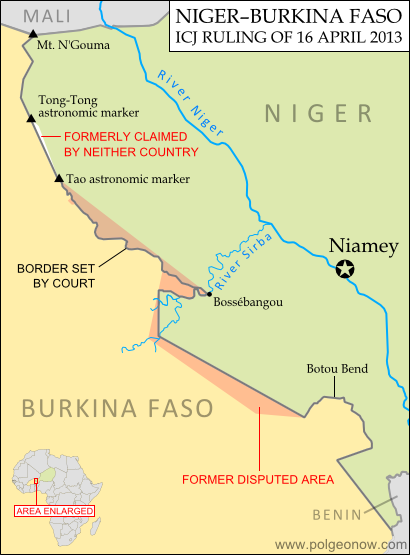
Map of the border dispute recently resolved between Niger and Burkina Faso
Niger and Burkina Faso recently resolved an unclear border situation. Map by Evan Centanni (click for details; CC BY-SA).

Another thing political maps imply is that borders at least have strictly defined locations in principle, even if they’re usually invisible on the ground. If they weren’t well-defined, they wouldn’t all be drawn with solid lines on the map, right? Wrong. Many countries have borders that have never been precisely defined by treaties, a process called “delimitation”.

Even fewer have been actually “demarcated”, or marked on the ground. In fact, undefined borders are such a big issue among the relatively young countries of Africa that the African Union operates an official border program to encourage the ongoing delimitation of national boundaries.

The fudge factor in national borders isn’t always big enough to make a difference to where they’re drawn on the world map – but their fuzziness can sometimes have major effects on international relations. An undefined border is a ripe environment for the birth of territorial disputes when neighboring countries have different ideas of where the border should run.

Sometimes these disputes are only low-level disagreements, such as the one recently resolved between Niger and Burkina Faso; but in other places like the border between Sudan and South Sudan, they can escalate into bloody conflicts.

Undefined Borders: More Articles and Maps

4) Disputed Territories
Your world map may label a few well-known territorial disputes, caused either by vague borders or conflicts over island groups. You might then reasonably conclude that disagreements over who owns a place, though they do happen, are relatively few and far between. Unfortunately, your conclusion would be incorrect. There are far more disputed territories in the world than you’ve probably ever imagined.

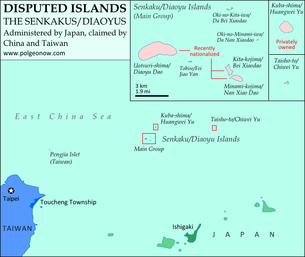
Map of the Senkaku/Diaoyu Islands, controlled by Japan but claimed by China and Taiwan
Map of the Senkaku/Diaoyu Islands, disputed between Japan, China, and Taiwan (map by Evan Centanni).

The most bizarre disputes range from high-profile cases, such as the five-way feud over the Spratly Islands, to quieter anomalies like Bir Tawil between Sudan and Egypt, both of whom claim it belongs to the other.

You may have heard of those, but did you know that (at least on paper) Mongolia is claimed by Taiwan? Or that more than half of Guyana is claimed by Venezuela? What about the several territories disputed between the U.S. and Canada? And those are just the land disputes – wait until you hear about the oceans!

Disputed Territories: More Articles and Maps

5) Territorial Seas
One thing completely left off of most maps is ownership of the sea. The occasional border lines you see across straits on your map are just showing who owns the islands on either side, not who owns the sea in between. The uninterrupted expanse of blue on most maps then might imply that the seas are the domain of no country. This is true for parts of the open ocean far from any coastline – but closer in, countries can and do exercise territorial rights over their neighboring seas. According to international best practices, a country is entitled to extend its territory up to 12 nautical miles (NM) out from its coastline, regulate economic activity out to 200 NM, and sometimes control seafloor oil and mineral exploration out to much further.

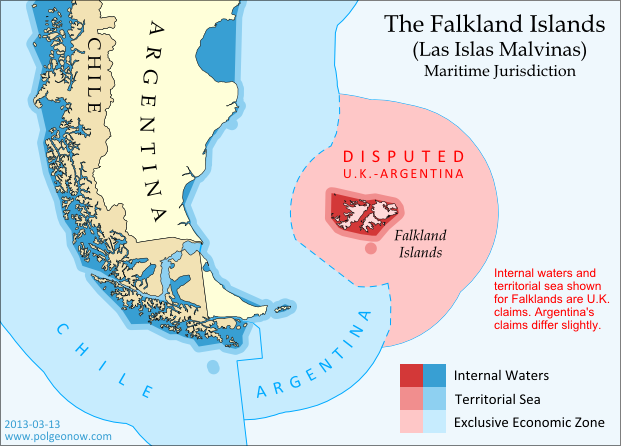
Map of territorial seas and exclusive economic zones (EEZ) around the Falkland Islands (Malvinas), controlled by the U.K. but claimed by Argentina
Both the land and the seas of the Falkland Islands are disputed between the U.K. and Argentina. Map by Evan Centanni (click for details; CC BY-SA).

But the divvying up of the world’s seas is still an ongoing process, and there are probably even more maritime disputes than land-based ones. Some countries, like Peru and Ecuador, refuse to recognize the 12 NM limit, claiming sovereign territory out to a full 200 NM. In even more cases, neighboring countries just can’t agree on where to draw the border between their respective territorial seas.

International law does provide guidance on how to divide it up, but for now many countries make claims far beyond what seems reasonable, apparently hoping they have something extra to give away in future negotiations. The most extreme claims, like China’s infamous “Nine-dotted Line” around most of the South China Sea, don’t seem to follow much legal logic at all.

Maritime Jurisdiction: More Articles and Maps

So next time you find yourself looking at a political map of the world, remember to be critical and take those borders with a grain of salt!

Other Articles You Might Like:
5 Countries You’ve Never Heard Of (by Their Native Names) 
How Many Countries Are There in the World?
Parade of Nations: Which Countries Are (and Aren’t) in the Olympics?