Catalonia Referendum: Detailed Results in 5 Maps

This map report is part of our Referendum 2017 coverage, spotlighting controversial independence votes in two of the world’s autonomous regions: Kurdistan voted for independence from Iraq last month, and Catalonia tried to vote on leaving Spain on Oct. 1. Now we’ve mapped out Catalonia’s results in detail based on data from the regional government.
 

Catalan referendum 2017 map: Detailed, municipality-level map of results in Catalonia's disputed October 2017 referendum on independence from Spain, showing proportion of YES votes in favor of independence in each municipality. Boundaries of comarques (comarcas) shown. Labels cities of Barcelona, Tarragona, Lleida, and Girona. Colorblind accessible.

Controversial Independence Vote

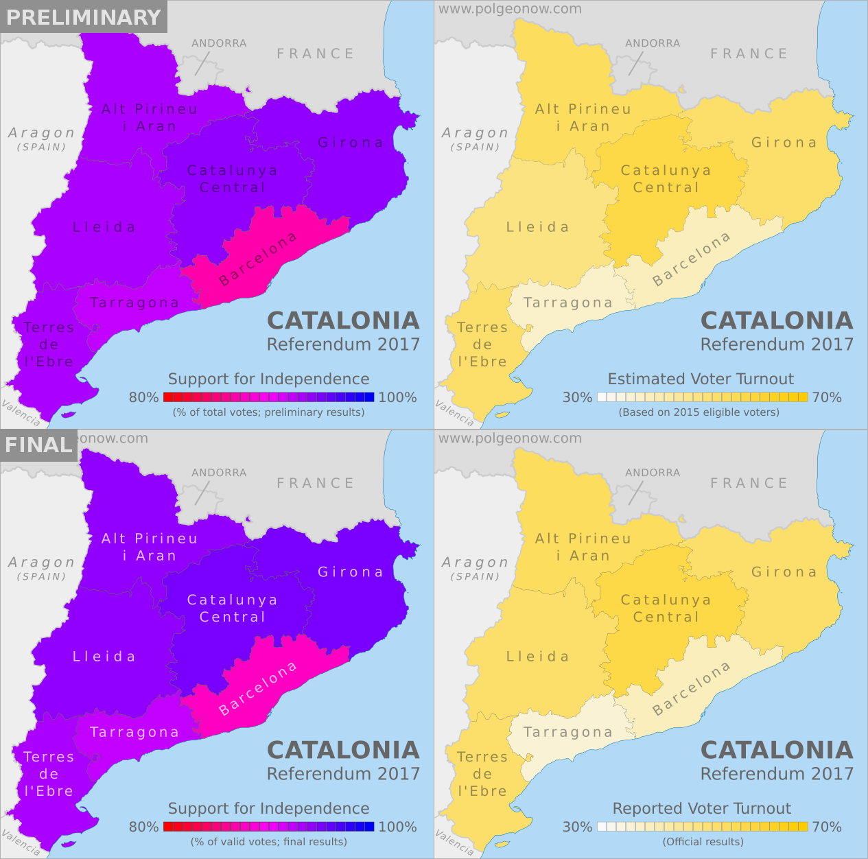
On October 1, Spain’s autonomous region of Catalonia tried to hold a referendum on independence from Spain. After Spanish courts ruled the vote illegal, Spanish national police attempted to prevent voting, and the result was that voting was disrupted in many areas and not organized properly in most others. Still, Catalan government data states that some 42% of the region’s residents came out to vote anyway, and of those who did, about 90% voted in favor of secession. Though Catalonia’s president had promised to declare independence within 48 hours of a YES victory, so far he’s delayed doing so.

Important Note: Because Catalonia’s government encouraged voters to evade police disruptions by voting outside of their home municipalities if necessary, many smaller towns registered more votes than their total number of residents. That also means these maps should be seen more as a picture of people who voted in each municipality than of people who live in that municipality.

Municipalities are grouped by the thicker lines into county-like comarques. You can find the names of the comarques on this reference map.

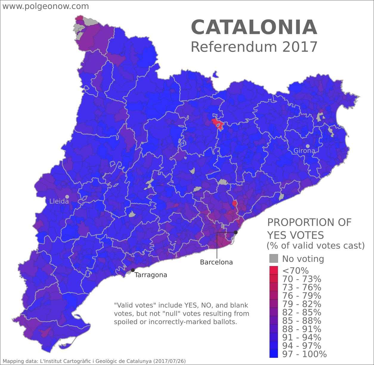
Which parts of Catalonia supported independence the most, and least?

The above map shows how pro-independence voting varied between Catalonia’s 948 municipalities. Though Spanish police or other opponents managed to shut down some polling stations (shown in gray), most municipalities registered large proportions of ballots answering YES to the question, “Do you want Catalonia to become an independent state in the form of a republic?” In fact, no municipality’s votes came in with less than 64% in favor of independence.

Rural areas tended to register higher proportions of YES votes than urban areas, with concentrations of NO votes clustered in two key areas: (1) the suburbs of Barcelona, Catalonia’s largest city and most diverse area, and (2) the Aran Valley at Catalonia’s northwestern tip, an isolated area separated from the rest of Catalonia by the Pyrenees Mountains, where people traditionally speak a language called Aranese instead of Catalan. These larger patterns support the common wisdom that support for Catalan independence comes mainly from people who speak the Catalan language.

There were ten municipalities where YES to independence received a whole 100% of the vote. Meanwhile, the two towns standing out in bright red, for low proportions of YES votes, are Borredà in the north and Palau-solità i Plegamans in the south. Here are the municipalities with the highest and lowest proportions of votes for independence:

Highest Proportion of YES Votes

  1. La Pobla de Lillet (100%)
  2. Vilamaniscle (100%)
  3. Bell-lloc d’Urgell (100%)
  4. Cabó (100%)
  5. Cava (100%)
  6. Guimerà (100%)
  7. Linyola (100%)
  8. Montoliu de Segarra (100%)
  9. Sant Guim de la Plana (100%)
  10. Sidamon (100%)
Lowest Proportion of YES Votes

  1. Borredà (64%)
  2. Palau-solità i Plegamans (70%)
  3. Badia del Vallès (74%)
  4. Bausen – Aran Valley (77%)
  5. La Llagosta (77%)
  6. Santa Coloma de Gramenet (79%)
  7. Barberà del Vallès (79%)
  8. Viladecans (78%)
  9. Esplugues de Llobregat (78%)
  10. El Prat de Llobregat (81%)
Catalan referendum 2017 map: Detailed, municipality-level map of reported voter turnout in Catalonia's disputed October 2017 referendum on independence from Spain. Labels cities of Barcelona, Tarragona, Lleida, and Girona. Boundaries of comarques (comarcas) shown. Colorblind accessible.

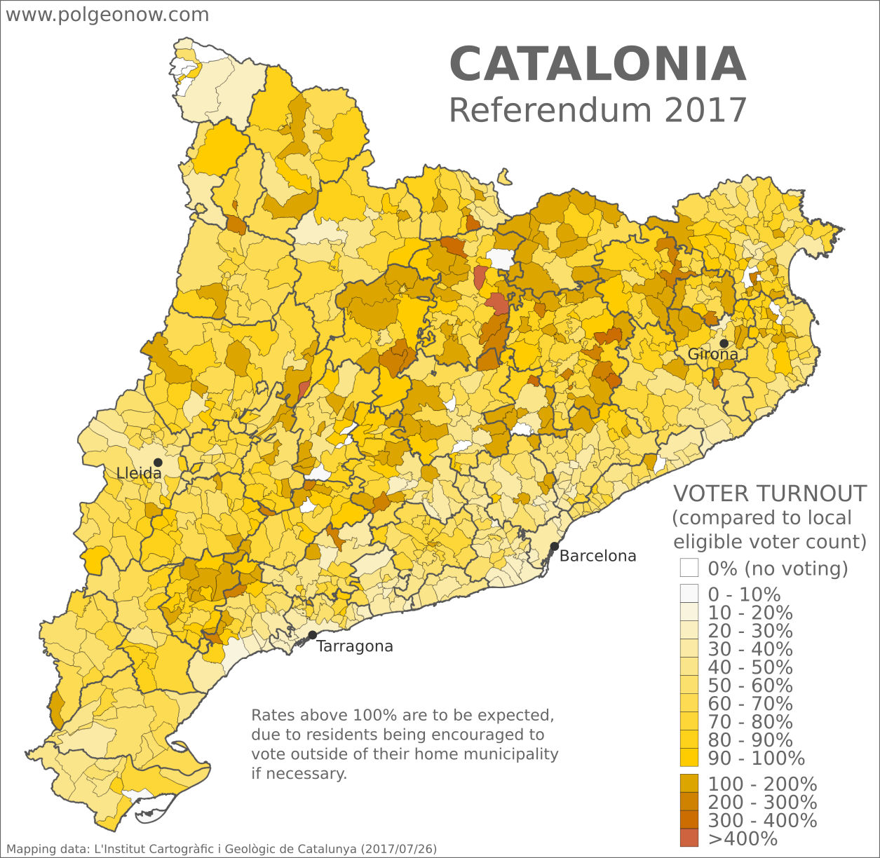
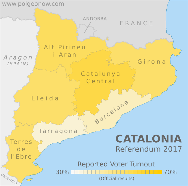
Where in Catalonia was voter turnout highest, and lowest?

As seen in the yellow-shaded map above, voter turnout varied across Catalonia’s municipalities, ranging from zero turnout where polling stations were shut down, all the way up to…well, over 700%. Though some opponents of the referendum have jumped on these figures as evidence of election fraud, turnout of over 100% was actually expected in many municipalities because of the unusual structure of the referendum. Anticipating police interference, Catalonia’s government allowed people to vote at any polling station where they were able to, even outside their home municipality. As such, voter turnouts over 100% neither prove nor disprove accusations of vote rigging or multiple voting by pro-independence activists.

There were 13 municipalities where voting never occurred at all, shown in pure white on the above map. According to the Catalan government, these are municipalities where “voting was not possible because of police action,” though it’s not clear how much effort was really made to hold the vote in the Aran Valley at Catalonia’s northern tip, where support for independence is reportedly very low.

Municipalities with no voting: 

  1. Callús (central Catalonia)
  2. Castellgalí (central Catalonia)
  3. Granera (central Catalonia)
  4. Estaràs (central Catalonia)
  5. Forès (central Catalonia)
  6. Sant Cebrià de Vallalta (E. of Barcelona)
  7. Garrigàs (E. of Girona)
  8. Sant Miquel de Fluvià (E. of Girona)
  9. La Tallada d’Empordà (E. of Girona)
  10. Arres (Aran Valley)
  11. Es Bòrdes (Aran Valley)
  12. Bossòst (Aran Valley)
  13. Canejan (Aran Valley)

As with high proportions of YES votes in the previous map, areas of low voter turnout are clustered around urban areas and the Aran Valley, though in this case stretch out more uniformly across much of the coast, and are just as prevalent in the Tarragona area as in Barcelona. Meanwhile, high turnout was the norm across much of Catalonia’s rural interior. Here are the municipalities with the highest and lowest turnout, other than those where polling places were closed:

Highest Reported Voter Turnout

  1. La Quar (793%)
  2. La Nou de Berguedà (521%)
  3. Cabanabona (402%)
  4. Gisclareny (378%)
  5. Urús (366%)
Lowest Reported Voter Turnout

  1. Sant Carles de la Ràpita (3%)
  2. La Pobla de Lillet (3%)
  3. Montoliu de Segarra (4%)
  4. Sant Andreu de la Barca (15%)
  5. Mont-roig del Camp (16%)

Note that some of the municipalities with over 100% turnout are located near towns where voting was completely shut down. This could be the result of people blocked from voting traveling to nearby municipalities to cast their ballots. Of course, the magnitude of an effect like that might vary depending of whether neighboring municipalities have comparatively large or small populations to begin with. Which brings us to our next map…

Catalan referendum 2017 map: Detailed, municipality-level map of eligible voter population at the time of Catalonia's October 2017 disputed referendum on independence from Spain. Labels cities of Barcelona, Tarragona, Lleida, and Girona. Boundaries of comarques (comarcas) shown. Colorblind accessible.

How many voters live in Catalonia’s municipalities?

Voter turnout is calculated by dividing the total number of ballots cast by the number of eligible voters who live in an area. And as seen in this map, the reported eligible voting population of Catalonia’s municipalities varies immensely, from as few as 25 people in tiny Sant Jaume de Frontanyà to as many as 1.14 million in Barcelona proper.

Comparing with the previous maps, we can see that both low voter turnout and low proportions of votes for independence generally correlate to highly populated areas, while high turnout and high rates of YES votes correlate with less-populated areas (the city of Girona is a notable exception, with a high population and relatively low voter turnout, but a very high proportion of support for independence).

It’s also clear that municipalities reporting voter turnout over 100% are mostly low-population areas. In fact, nearly all of them reported eligible voter populations of under 500 people. Notable exceptions – and the only ones with voter populations over 1,000 – are Polinyà (5,910 people / 173% turnout), Palau-solità i Plegamans (10,891 people / 142% turnout), and Sant Quirze del Vallès (14,531 people / 109% turnout). These three municipalities are visible in the yellow voter turnout map as the three over-100% turnout areas closest to Barcelona, all located near each other on the edges of the highly-populated metropolitan area.

This is consistent with the hypothesis that turnout over 100% was due mainly to voters flooding out of high-population areas and into low-population areas to cast their ballots. And in fact, a close examination of the maps shows that nearly all of the over-100% turnout municipalities directly border other municipalities with lower turnout (or no voting at all) and significantly higher populations.

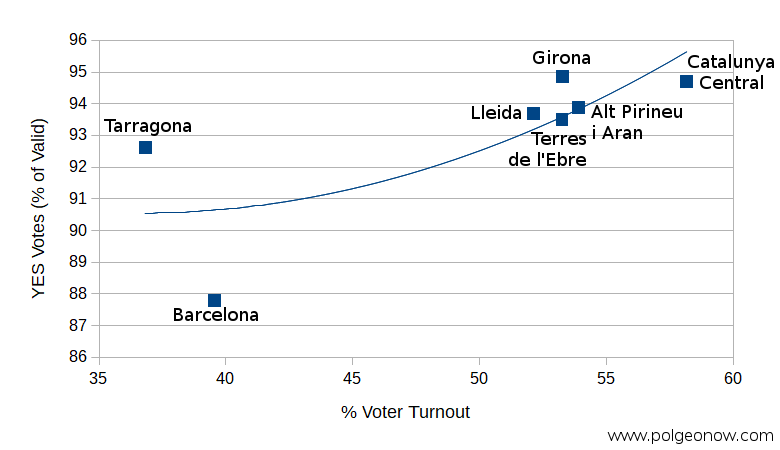
Of course, low turnout across Catalonia as a whole begs the question, if we include people who didn’t leave home, what proportion of Catalans actually cast ballots for independence?

Catalan referendum 2017 map: Detailed, municipality-level map of results in Catalonia's disputed October 2017 referendum on independence from Spain, showing per capita YES votes in favor of independence as a proportion of total eligible voter population in each municipality. Boundaries of comarques (comarcas) shown. Labels cities of Barcelona, Tarragona, Lleida, and Girona. Colorblind accessible.

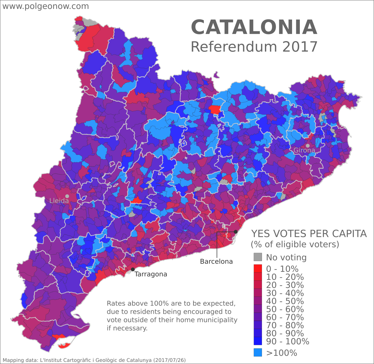
How many of each municipality’s people actually voted for independence?

This map, a kind of special hybrid between the YES/NO map and the voter turnout map, shows YES votes as a proportion of each municipality’s total eligible voters, rather than of valid ballots cast. If every voter had cast ballots within their home municipality, you could think of it as showing the minimum actual support for independence in each area, as if non-participants in the referendum had all voted NO. Of course, we shouldn’t assume that all non-voters are against independence – even determined pro-independence voters were sometimes prevented by police from casting ballots – but it’s likely that quite a lot of opponents sat this out, and we certainly can’t assume the opposite.

Yet as we’ve seen above, the movement of voters to other municipalities makes the situation more complicated: We can’t really determine how many people supported independence in a municipality that was flooded with 400% voter turnout from other regions, to say the least.

Still, major differences from the results map at the beginning of the article reveal some interesting patterns. For one thing, it’s clear from this map that we can’t assume a majority of Catalans actually support independence: In the highly-populated areas along the coast and around major cities, the total number of YES votes for independence was often much less than half the total number of eligible voters. Even many of the rural central municipalities show proportions not much over half, if that.

In fact, many geographical areas lost in the dark blue YES votes of the first map come out looking decidedly lukewarm about independence here, including the the area near Catalonia’s northeastern border with coastal France, as well as clumps along the boundaries of the Spanish regions of Aragon to the west and Valencia to the south. And that’s not to mention a smattering of new red spots peppered across Catalonia’s rural interior.

But while we’re on the topic of the many Catalans who don’t support independence, let’s look at one last map…

Catalan referendum 2017 map: Detailed, municipality-level map of results in Catalonia's disputed October 2017 referendum on independence from Spain, showing proportion of blank votes in each municipality. Boundaries of comarques (comarcas) shown. Labels cities of Barcelona, Tarragona, Lleida, and Girona. Colorblind accessible.

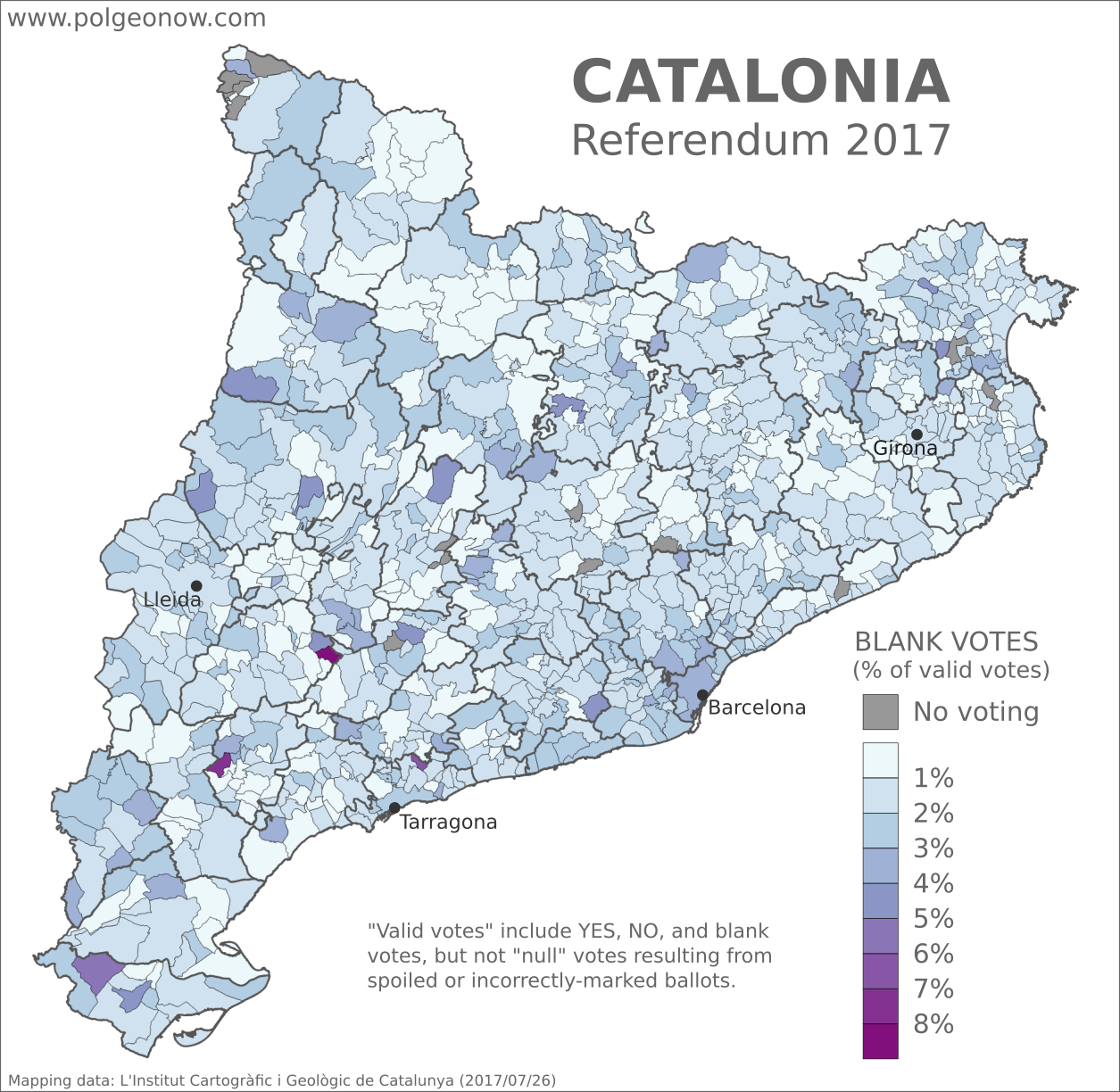
Where in Catalonia did people cast blank ballots?

During the lead-up to Catalonia’s attempted referendum, it was well-documented that many Catalans – including the mayor of Barcelona – strongly supported having a vote even though they opposed independence. Polls earlier this year put support for independence at just under 50%, while support for holding a referendum was over 70%. So it stands to reason that many anti-independence residents still made an effort to get out and vote NO.

But what about undecided voters, who neither supported nor opposed independence but felt strongly about their right to vote on it? These people may have been largely responsible for the referendum’s many reported blank votes – ballots cast without marking either the YES or the NO option on independence. And rates of blank voting varied significantly between municipalities.

In our earlier article on larger-scale referendum results, we reported that the greater Barcelona region had a much higher rate of blank votes than other regions, averaging 2.6% compared to between 1.2% and 1.6% for other regions. That’s hard to see on the municipalities map, probably because high rates of blank votes in the Barcelona region were concentrated in just a few very high-population areas (recall that the city of Barcelona, which registered just over 3% blank votes, has a population of over one million).

Variation in blank voting rates across central Catalonia don’t seem to match up with any patterns from the other maps, and may be just statistical noise related to the very small populations of many rural municipalities. Tellingly, the three municipalities colored in darkest purple, for very high rates of blank votes, all have eligible voter populations of less than 150 people, with just three to six total blank ballots cast in each one. If just one person chose not to vote blank in these municipalities, the rate would see a major drop.

It seems the main takeaway is that blank voting was a phenomenon mainly in Barcelona, more than in any other part of Catalonia. Perhaps this was a reaction to violent police crackdowns that took place in the city, or just part of the capital’s specific political culture. Interestingly, Barcelona proper also had a relatively high rate of support for independence among participating voters compared to neighboring suburbs. Meanwhile, the cities of Lleida and Girona had rates of blank votes similar to the neighboring countryside, despite registering less overall support for independence.

Learn More: What is Catalonia, and why would it want independence?

Stay tuned to PolGeoNow and the PolGeoNow Twitter feed for more updates on Catalonia’s push for independence, plus new developments around the Kurdistan referendum in Iraq. Click here to view all Referendum 2017 articles.

Updated! Catalonia Referendum Results Maps: How Did Each Region Vote?

Updated! This article’s maps and text have been updated with final results released by the Catalan government. See below for more details. We also now have an article with detailed results maps broken down by municipality.

This map report is part of our Referendum 2017 coverage, spotlighting controversial independence votes in two of the world’s autonomous regions: Kurdistan voted for independence from Iraq last week, and Catalonia voted to leave Spain this weekend. Now detailed results are available, and we’re working on getting them mapped out.

2017 Catalonia independence referendum results map. This map shows support for independence by region (vegueria) in the October 1 Catalan vote on independence from Spain. Colorblind accessible. 2017 Catalonia independence referendum voter turnout map. This map shows voter turnout by region (vegueria) in the October 1 Catalan vote on independence from Spain. Colorblind accessible.
Maps by Evan Centanni, starting from blank map by Vinals and Rwxrwxrwx. License: CC BY-SA

Catalonia Independence Vote (Updated)

Detailed, final results are now available for Catalonia’s controversial referendum on independence from Spain. The vote was widely disrupted by the Spanish police after courts ruled it illegal, resulting in massive irregularities that will make it hard for outsiders to accept as a proper democratic referendum. Still, some 43% of eligible Catalan voters reportedly made it out to cast ballots, meaning there’s plenty of reported data to look at.

These maps, originally published two days ago based on preliminary results and estimates of voter turnout, have now been updated with the final data from the Catalan government. The final results showed no change in support for independence significant enough to effect our map. However, we decided to re-do the map using the Catalan government’s official method of calculating the percentage, which excludes spoiled ballots from the total votes (the original map included these so-called “null votes” in the total votes when calculating the percentage of YES votes). This method results in slightly higher figures for all regions. We also changed the color of the region labels, because they were hurting our eyes.

The voter turnout map, originally based on estimates of eligible voters drawn from 2015 election data, has also been updated with official figures. The only two changes: Tarragona had a slightly lower voter turnout rate than we estimated, and Lleida had a somewhat higher turnout than our estimate. Click here to compare the original maps with the new versions.

Who voted for independence?

Support for independence among those managed to vote was very high, with 90% of valid votes and 89% of total ballots cast. This is unlikely to represent the actual proportion of the Catalan population that supports independence, since polls earlier this year showed the region split roughly half and half over the question. On the other hand, about three-quarters of Catalans supported the idea of at least voting on it, and after the Spanish government’s heavy-handed crackdown, it’s likely that independence has only gotten more popular.

One proposed flag for an independent Catalonia
Catalonian independence flag.  
(Graphic by Huhsunqu. CC BY-SA; source)

As seen on the left-hand map above, independence received the highest percentage of votes in Girona and the rural Catalunya Central – the referendum passed by nearly 95% in both areas. Meanwhile, in Barcelona, Catalonia’s capital and largest city, support was significantly lower, but still reached about 88% among those who voted. Barcelona is a large, diverse city, and many residents may be immigrants from other parts of Spain who don’t buy into the idea of Catalonia as a separate country.

How many people showed up to vote?

The Catalan government’s official voter turnout figures have been a matter of some controversy, since the referendum was carried out without access to the official Spanish voter rolls, amid police attempts to confiscate the regional government’s own records. In addition, to avoid the police crackdown on polling stations, residents were encouraged to vote anywhere in Catalonia that they could, even though they would normally have to go to a polling station in the municipality where they were registered. This resulted in some municipalities’ total ballot counts being higher than their actual population of eligible voters – fueling accusations of fraud by the referendum’s opponents.

Catalonia independence referendum 2017: Scatter plot showing estimated voter turnout vs. percentage of votes for independence by region (vegueria). The results show that voter turnout was positively correlated with support for independence: Regions with higher turnout also had a higher proportion of YES votes on independence from Spain.

But that doesn’t stop us from doing an analysis of the claimed data. As seen on the right-hand map above, turnout was highest in Catalunya Central, and lowest in Tarragona and Barcelona – the same two regions that had the lowest support for independence.

And in fact, when we graphed out voter turnout versus YES votes, there does appear to be a correlation: In general, the higher voter turnout was in a given region, the more people there voted for independence (and vice versa).

Maybe this should be no surprise: It’s likely that many opponents of Catalan independence didn’t feel motivated to defy the Spanish government by voting. After all, the police were taking the opponents’ side by trying to shut down the vote and prevent independence. So you might indeed expect that people in pro-independence places would have come out to vote in bigger numbers, while people in less separatist areas would stay home.

Interestingly though, the less-separatist, low-turnout Barcelona region also had by far the highest rate of blank votes. Some 33,000 people, or 2.3% of participating voters in the metro area, didn’t write anything on their ballots – that’s compared to 1.2% to 1.6% for other areas. Given the major police efforts to block people in Barcelona from voting, it’s hard to imagine that truly unenthusiastic voters would have made it to the ballot boxes. But these blank votes could represent people who wanted defy the police crackdown by voting out of principle, even if they were undecided about actual independence.

Want to see the picture in more detail? Check out our new article with municipality-level results maps for the Catalan referendum!

Learn More: What is Catalonia, and why would it want independence?

Stay tuned to PolGeoNow and the PolGeoNow Twitter feed for more updates on Catalonia’s independence vote, plus new developments around the Kurdistan referendum in Iraq. Click here to view all Referendum 2017 articles


Graphic of current Catalan flag by Wikimedia Commons user Martorell (License: CC BY-SA; source).

UK Votes to Quit EU: Map of How Britain Voted in the Brexit Referendum

(Subscribers click here to view this article in the members area.)

By Evan Centanni

UK Brexit vote map: Map of election results in Britain's June 2016 referendum on leaving the European Union (EU). Continuous red-to-blue color scheme gives a more honest depiction of the similarities between different election districts. Colorblind accessible.
Map of election results in the UK’s “Brexit” referendum. Modified by Evan Centanni from Wikimedia map by Mirrorme22, Nilfanion, TUBS, and Sting (CC BY-SA).

UK Votes to Quit EU
The results are in for yesterday’s referendum on UK membership in the European Union, and the winner is “Leave”. Brits voted by a margin of 52% to 48% in favor of exiting the European Union, making a “Brexit” (British exit from the EU) more or less guaranteed in the coming years. Britain will become the first member country ever to leave the EU, and the British overseas territory of Gibraltar is expected to get pulled out with it.

Learn More: Brexit: 9 Geography Facts You Should Know About the Referendum and Britain’s EU Membership

Who Voted to Stay
Voter tendencies varied a lot from place to place. Support for the “Remain” side was strong across Scotland, culturally Irish parts of Northern Ireland, the London area, and a handful of other cities in England (led by Cambridge, Oxford, and Brighton).

By far the greatest show of support for Remain was a win by 96% in Gibraltar – which isn’t even in the UK proper, but got to vote because of its unique status as a British external territory that’s in the EU.

Photo Essay: Gibraltar and the Brexit Referendum

Gold: Districts with over 50% for Remain
Blue: Districts with over 50% for Leave
Map from Wikimedia Commons (click for more info)

Who Voted to Leave
The “Leave” vote, on the other hand, was strongest in eastern England, with substantial support from all across England, Wales, and the most ethnically British parts of Northern Ireland. The vast majority of the UK’s population lives in England, and this was enough to carry the referendum.

The district with the highest support for Leave was Boston, England, where 76% of voters favored leaving the EU

England, Wales, Scotland, and Northern Ireland
Taking the UK’s “constituent countries” as wholes, England and Wales each voted 53% for Leave vs. 47% for Remain, while Scotland supported Remain by 62% to 38%, and Northern Ireland supported Remain by 56% to 44%.

Scotland was the most consistently supportive of Remain, with every district at least 50% in favor of staying in the EU. England, Wales, and Northern Ireland all had some districts that went each way, though Northern Ireland was probably the most geographically divided, with 7 districts favoring Leave, and 11 favoring Remain.

Maps of How Scotland’s Regions Really Voted

Good geographers know that maps can lie to you. Every map emphasizes some aspects of a place at the expense of others, giving it a lot of power to lead careless readers astray. Maps of Scotland’s recent independence referendum are misleading us about the reality, even if not intentionally.

Premium members click here to view this article in the ad-free members area. Not a member yet? Subscribe now!
 

Map of results in Scotland's September 18, 2014 independence referendum. Voters were polled on whether or not to separate from the UK. Map shows relative proportion of yes and no votes for each of Scotland's council areas, using a gradient rather than contrasting colors for small differences.
Map by Evan Centanni, based on blank map by TUBS and NordNordWest (CC BY-SA)

By Evan Centanni

Misleading Maps
By now you’ve probably heard the results of Scotland’s independence referendum: voters chose “no” by a solid margin of 55% to 45%. Check out our previous article to learn more about what would have happened if Scotland had voted “yes”.

Maps like this one from the BBC and this one from Wikipedia have popped up since the results came out, showing how each of Scotland’s council areas voted. Most of the country is in red for “no”, with a few “yes” areas in green.

But if one area went 51% for “yes”, and another 51% for “no”, those two areas actually voted almost identically – yet contrasting red/green maps make us feel like they’re polar opposites (not to mention that one-in-thirty readers has trouble seeing the difference between red and green).

How the Councils Really Voted
Whether each area’s people voted just over or just under 50% in favor isn’t actually that important. What matters is how far the balance was tipped in each region. This is not the U.S. presidential election, where the final vote is actually made by delegates obligated to go by the majority in each state. All the votes across Scotland were pooled together to determine the result, so which side of the 50-yard line each area came out on has no effect .

In reality, the vote was split in every part of Scotland. No council area voted more than 58% in favor of independence or more than 68% against. The above map is designed to show how close the vote really was all across the country. Since no area came close to voting completely for independence (blue) or completely against it (red), on this map Scotland’s council areas all end up colored in purplish hues.

For Your Reference: Map of Scotland’s council areas with names labelled

Map of results in Scotland's September 18, 2014 independence referendum. Voters were polled on whether or not to separate from the UK. Map shows relative proportion of yes and no votes for each of Scotland's council areas, using a gradient rather than contrasting colors for small differences and shading to represent the total number of valid ballots case in each region as a way of normalizing for population.
Map by Evan Centanni, based on blank map by TUBS and NordNordWest (CC BY-SA)

The Glasgow metropolitan area, the main region where independence bagged more than half the vote, appears as a slightly bluish purple lump in the bottom-center, while border areas that voted “no” by a larger margin turn out purplish-red (as does Orkney, the group of islands just north of the Scottish mainland). Most of the remaining councils voted more narrowly against independence, showing up in intermediate hues.

Population Matters
In fact, the above map still hides an important factor in the results: the council areas didn’t each have the same number of votes. While turnout was high across the country (75-91%), population varies drastically from council to council. Glasgow city cast nearly 356,000 ballots, while rural Orkney had a mere 14,887.

The second map (at left) tries to show the relative importance of each area in deciding the countrywide result. Here, the same range of purple hues are made lighter or darker depending on how many total valid ballots were cast in each council area. It’s a bit more complicated to read, but the message is clear.

Flag of ScotlandCountry Name:  
• Scotland (English, Scots)
• Alba (Scottish Gaelic)
Current Status:  
Country within the United Kingdom 
Capital: Edinburgh

The outer islands’ voting populations are so small that they look white to the naked eye, with each group contributing only about five percent as many votes as the biggest city. Meanwhile, Scotland’s two major cities of Glasgow (left, bluish) and Edinburgh (right, reddish) stand out sharply with their huge numerical advantage.

The country’s number three city, Aberdeen, seems to have its votes divided between the surrounding Aberdeenshire (large, medium-shaded chunk at upper-right) and the city proper (lighter-shaded kernel along the coast). Meanwhile, the Scottish Highlands, the huge region at upper-left, are sparsely populated but carry some collective clout due to sheer size.

Maps that contrast colors on either side of the 50% mark may be a simple and attention-catching way to show election results, but they mislead us by making countries look more geographically-divided than they really are.

See Also: How Sharply Divided is Ukraine, Really? Honest Maps of Language and Elections

How Sharply Divided is Ukraine, Really? Honest Maps of Language and Elections

There’s no question that Ukraine’s current crisis arose from major political divisions in the country, and it’s true that language is an issue. But some online news websites have sensationalized and exaggerated these divisions through misleading maps. PolGeoNow offers a pair of maps that better communicate the blurriness of the supposed lines between western and eastern Ukraine. 

(For a map of current events from January up to this week, including protester control, government occupations, and the Russian invasion, purchase our premium map of the Ukraine crisis or become a member.)

Map of the results of Ukraine's February 2010 presidential runoff election between Yulia Tymoshenko and Viktor Yanukovich
A more honest map of Ukraine’s 2010 presidential election. By Evan Centanni.

Premium members click here to view this article in the ad-free members area. Not a member yet? Subscribe now!

Article by Evan Centanni 

Misleading Ukraine Maps
In January, the Washington Post’s Max Fisher wrote a popular map-illustrated blog post about the political and linguistic divisions fueling Ukraine’s crisis, then at the height of its pro-Europe protest phase. Later, CNN followed the Post’s lead and published a similar set of maps. However, the maps in both articles are designed in a way that makes the divisions look much sharper and more black-and-white than they really are. There’s not, as Fisher preposterously claims, “an actual, physical line” splitting Ukraine in half. Instead, there’s a gradual shading of mixed populations whose ethnic identities and voting history don’t always correlate to the country’s current political divisions.

The 2010 Presidential Election
The centerpiece of Max Fisher’s Washington Post article is a map superimposing early protest information on a map of results from the 2010 presidential election, in which the now-ousted Viktor Yanukovich won a majority over opposition candidate Yulia Tymoshenko. Although Fisher did distinguish in the map between regions voting overwhelmingly for one candidate and regions where the winner received a narrower majority, the sharpness of the east-west division is badly exaggerated by the colors he chose.

Using orange for Tymoshenko and blue for Yanukovich was normal, but the regions with highly-mixed results should have used some color in between. Instead, the map uses light orange for small Tymoshenko victories and light blue for small Yanukovich victories, making regions that actually weren’t far apart in their votes still look sharply separated due to the clashing colors. CNN’s equivalent map is even worse, using bright red and bright blue. With eye-grabbing, clashing colors like that, it’s no wonder someone might think Ukraine is literally bisected down the middle.

But that’s just not the reality. As the map above shows more clearly, many regions, including even some in the west, voted only narrowly for one candidate over the other. The colors don’t transition perfectly smoothly from one end of the country to the other – every region went to one candidate by at least 10 percentage points – but there’s not a sharp dividing line either. A more detailed map, with the districts of each region separately colored, would probably show an even less distinct divide.

So how well do the 2010 election results map to the current crisis? Not too badly. The Lviv region did end up taking a leadership role in the protests against Yanukovich, and Donetsk has been among the forefront of regions opposing him. However, protests did eventually spread across the whole country by February, and there were some exceptions to the yellow vs. blue pattern. If you’d like to make a detailed comparison, check out our political overview map report for the Ukraine crisis, accessible to premium members or by individual purchase.

Map of languages in Ukraine by region (oblast), showing gradation between Ukrainian and Russian languages while marking regions with large proportions of residents with other native tongues
Ukraine is even less clearly cut in half by language. Map by Evan Centanni.

Native Languages: Ukrainian vs. Russian
Both the Washington Post article and the CNN post also feature maps of the languages spoken in Ukraine. CNN does better on this than on the election map, at least choosing somewhat similar orange and red colors in an attempt to show the gradient in the proportion of Russian speakers across Ukraine’s regions. The Post’s Max Fisher, on the other hand, continues with the misleading contrasting colors, cutting Ukraine simplistically into an orange half and a blue half for the Ukrainian and Russian languages.

Most egregiously, Fisher’s map uses the label “Predominantly Russian-speaking” to blanket a number of regions where there are actually more native Ukrainian speakers than native Russian speakers. As the above map shows, Ukrainian is actually the majority language across most of the country. Only four regions – Donetsk, Luhansk, Crimea, and the special municipality of Sevastopol – have more Russian than Ukrainian speakers.

When comparing this map with the election map at top, it becomes clear that language is not as great an indicator of Ukrainian politics as some commentators imply. People whose mother tongue is Russian make up only 30% of Ukraine’s population according to the 2001 census, yet Viktor Yanukovich received more than 49% of the national vote in 2010 (as compared with Tymoshenko’s 45%).

It’s true that the strongest opposition to the new interim government is coming from the regions with Russian-speaking majorities, but there may be a specific reason for this: one of the new revolutionary government’s first acts was to repeal a Yanukovich-era law granting legal rights to minority languages such as Russian. (Note that being “ethnically Russian”, at least in official statistics, is not the same thing as being a native speaker of the Russian language; only 17% of people in Ukraine identify as “Russians”; many of the remaining Russian-speakers identify only as Ukrainians.)

Flag of Ukraine Full Country Name:  
• Ukraine (English)
• Ukrayina (Ukrainian)
Capital: Kiev

Other Major Languages
Another fact left out of the Washington Post and CNN maps is that Ukrainian and Russian are not the only major languages in Ukraine. Although they are by far the most widely-spoken nationwide, within several regions there are other languages which come in second or third. By now many followers of the news know that Crimea has significant population of Crimean Tatars, who speak a language related to Turkish. In the Crimean autonomous region, speakers of Crimean Tatar (11%) outnumbered speakers of Ukrainian (10%) in 2001.

But Crimea isn’t the only region with major minority language communities. In Chernivtsi, Romanian (12%) and Moldovan (7%) both outnumber Russian (5%), and in nearby Zakkarpatsia (capital: Uzhhorod) 13% of residents are native speakers of Hungarian. In Odessa, Ukrainian and Russian are the biggest languages, but Bulgarian (5%) and Moldovan (4%) are also present. (Data from Ukraine’s 2001 census, retrieved here).

Graphic of the Ukrainian flag is in the public domain (source).

Map of the 2014 Ukraine crisis, before and after the ouster of President Yanukovich, updated to March 3, 2014. Details shown include protester occupations, declarations of autonomy, and Russian invasion.

Want to see a comprehensive map of political control in Ukraine’s crisis from January up to this week? Purchase our premium map report for just $5.99.

Or you can become a member, and get access to all our premium content!